The savvy style of this project comes from screwless wall plates in black, white, and silver finishes. The clean and contemporary design coordinates well with a sleek home office.
Painted the same color as the wall, the plywood piece blends in and allows the wall plates to stand out.
Step 1: Cut the plywood sheet to 20 x 24 inches.
Step 2: Sand the plywood piece, and wipe clean. Apply spray primer and paint to the piece, allowing each coat to dry.
Step 3: Place the wall plates at right angles on the plywood piece, alternating colors as shown here. Glue the plates to the plywood piece. Allow glue to dry completely.
Step 4: Hang the project using picture hangers and appropriate hardware for your wall type.
Showing posts with label interior design. Show all posts
Thursday, November 17, 2011
Sunday, October 16, 2011
DIY-Kids Room goes Fishing
Super cute art decor for the kids room!
INSTRUCTIONS:
Step 1: Starting with a 2'x2' piece of ¼" birch plywood, cut a 15"x15" square. This will be used as the backer for the frame. Sand, prime, and paint the backer; then set it aside to dry. (We chose Valspar Exotic Sea (#331652), Pistachio Satin (#287422), and Mediterranean Gloss (#287419) paint colors for the three backers pictured.)
Step 2: Apply the fish template to a piece of 1"x4" poplar or pine, and cut out the shape with a jigsaw. Sand, prime, and paint the fish. (We used Valspar Satin La Fonda Copper (#331655) paint.)
Step 3: To frame the painted plywood backer using 1"x4" poplar or pine boards, cut top and bottom frame parts 16" long, and cut the sides 9" long. Glue and clamp the frame parts so the ends of the short pieces butt up against the inside edges of the long pieces; allow the glue to dry.
GOOD TO KNOW: Because this frame will be painted, you can patch minor gaps using homemade wood putty. Squirt a small amount of glue into a disposable container such as a paper cup. Mix in sawdust left over from cutting your frame boards until it forms a paste. Using your finger, work the paste into the gaps until the surface feels smooth. Then sand your patch flush with the wood.
Step 4: Sand the surface and edges of the frame. Then paint the outside face and all edges (but not the back) and let the frame dry. (We painted the frame with Valspar Satin White (#28277).)
Step 5: Center the fish in the frame and glue in place. (Consider placing a large book or other heavy object on the fish after gluing to ensure it adheres to the backer.)
Step 6: Attach a picture-hanger centered along the top edge of the backer, then hang on the wall.
Monday, October 3, 2011
Buliding Blocks Wall Art
Make multidimensional art with moulding pieces painted in cool colors and arranged in a checkerboard pattern. The repetition of circles and squares keeps the look simple and perfect for any casual space.
The artwork’s square shape perfectly fits this blank wall. If needed, cut the size of the plywood sheet to accommodate your space.
Step 1: Lightly sand the plywood piece, and wipe clean. Apply spray primer and spray paint to the piece, allowing each coat to dry.
Step 2: Divide 18 wooden rosettes into four groups. (You’ll have five rosettes in two groups and four rosettes in two other groups.) Spray-paint each group a different color, and allow to dry. TIP: Apply two or three light coats rather than one heavy coat.
Step 3: Arrange the rosettes in rows on the plywood piece, alternating colors as shown here. Align the edges of the outer rosettes with the plywood edges. Use wood glue to attach the rosettes to the plywood piece. Allow glue to dry completely.
Step 4: Hang the project using picture hangers and appropriate hardware for your wall type.
Thursday, September 22, 2011
Modern Stencil for a Stylish wall
INSTRUCTIONS:
Step 1: Enlarge a graphic stencil so the whole pattern can be repeated vertically to fit your room height (with spaces between stencils), and have three copies soft-laminated at the copy shop in case you damage some. Cut out the patterns with a crafts knife.
Step 2: Map out the number of columns you can fit along one wall and the space between columns. At one corner attach a stencil near the top of the wall with painter’s tape so the sides are vertical.
Step 3: Using a lightly coated foam roller, apply thin layers of paint over the stencil. (Press lightly or you’ll squeeze paint behind the stencil.) Then tape another stencil below the first at the margin you want and paint that design. Repeat until you reach the baseboards.
Step 4: With the first column done, space the stencil horizontally and stencil the next column. Repeat until you fill the wall.
Tuesday, August 2, 2011
Monday, July 25, 2011
New Office Project-July 2011
A cool retro inspired,
yet functional office and craft area.
Let us take your house and make it into your home!
Thursday, July 7, 2011
Saturday, June 11, 2011
Sunday, May 15, 2011
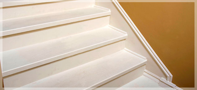
Steppin it Up-Create a Baseboard on a Dime.
Step 2: Determine the height of the faux baseboard and apply painter’s tape to desired height.
Step 3: Paint faux baseboard desired color (we matched ours to the stairs).
Step 5: Using finishing nails, attach shoe molding to edge of stair tread (where stair meets wall). Using finishing nails, attach chair rail to top of faux baseboard.
Step 6: Touch up nail holes with paint.
Sunday, April 17, 2011
The psychology of color-Enhance you enviroment
The psychology of color
1.) Create the illusion of space with bright colors: If you want your home to look larger than it really is – especially when it is about to go on the market – you can use bright and vibrant colors like yellows and eggshells to add space to your home exterior. As a warning, avoid the common color white. Although it can add space, it is nowhere near as effective as tinted colors.
2.) Appeal to a highly educated crowd with complex colors: For home exteriors and interiors, using colors that consist of more than one word can often appeal to highly educated people. On the other hand, simple colors appeal to lower budgets and lower education levels. When choosing complex colors, think of names like forest green or eggshell white.
3.) Build appetites in your kitchen with red: Red has been shown to increase appetite in most people – one of the reasons that many restaurants choose red patterns in their dining rooms. Using red in your kitchen to increase appetite is as simple as blending beige walls with red shutters or cabinet doors.
4.) Use foyer blends to naturally combine interior and exterior paint: One of the best ways to wow your guests as they enter your home is to use a blend of your interior and exterior colors in your foyer or entryway. You can also use your exterior paint color on parts of your interior to achieve the same general effect.
5.) Warm up your home with deep tones during the winter: Using reds, oranges and yellows in your home paint decor can make the home seem more welcoming from the outside or warmer on the inside – especially during the winter. If you are selling a home during the winter and are planning to paint, keep this in mind.
6.) Cool off in the summer with colder colors: Along the same lines as warm colors in the fall, cool colors, especially blue, can make your home seem fresh, cool and clean during the summer. A white exterior with blue trim is a popular choice for summer homes and painting projects.
7.) Use colors from your past: Many color consultants will say that using familiar colors from your childhood that remind you of fond memories – especially in the kitchen – can bring those memories back and create a pleasant mood. If you can’t remember any colors from your kitchen when you were growing up, just remember that reds and yellows are perfect for playful yet sophisticated kitchens.
8.) Use relaxing colors in relaxing rooms: In your bedroom and bathroom, cool colors can form a relaxing atmosphere with paint. Consider shades of blue, green or even lavender to calm yourself in your escape rooms. When using this technique, remember that the darker the shade of color you choose, the more apparent the effect.
9.) Stay away from red if you have high blood pressure: While it can increase appetite in your kitchen, dark shades of red are often associated with high blood pressure and irritability in other rooms of the house. If you would like a darker color paint for your bedroom or living room, go for a cooler color rather than a warm one.
10.) Flatter yourself with a familiar color in the bathroom: Love to wear a particular color? Consider that color in the bathroom. Think you don’t look very good in a color? Avoid this color for the bathroom at all costs. You want to look good when you check yourself in the bathroom mirror. Having a favorite color in the background really does help.
11.) Combine moods for an aggressive workout room: While it might make sense to use red paint in a workout room, this can actually overdo the sensation of feeling hot. If you want to use a warm color in your workout room, consider a delightful blend of blue and yellow paint on the walls. You can also go for a relaxing green-blue combination for a cooling effect to extend workouts.
12.) Concentrate in your home office with green: Green inspires concentration in a home office setting. And, after all, the faster you get your work done, the more time you will have to spend with your family. In addition to a green plant, try painting the room with a light green. However, don’t turn your home office into a jungle. Over doing it can be distracting. Any painting contractor will tell you green is one of the most popular colors being used right now in home design.
13.) Inspire optimism with yellow: As you might expect, yellow is a perfect color for a sunroom. However, a great way to use yellow inside your home is in an entryway or enclosed front porch. As you leave for the day to go to work or school, the yellow paint in this area will give you one last boost of optimism before the daily grind.
14.) Don’t be fooled by purple: Although purple signifies wealth and romanticism, it is very rare in the natural world and can be very artificial within your home decor. If you really want some purple in your home, try blending it with more natural colors like subtle yellows or greens.
15.) Blend brown for a natural look in your den: If you love the look of wood or leather or already incorporate this earthy natural look in any room of your house, adding some brown paint can amplify the appearance. You should be warned, though, that brown can cause depression in some people.
16.) Black isn’t just for a teenager’s room: Black can be a tough nut to crack if used to paint your walls. The problem with black is that it gives the illusion of tight space. If you would like to satisfy your teenager’s cries for a black room, consider a black ceiling with a few stars. If you want to go all out, you can decorate with a nighttime landscape theme across the room.
17.) Use pink for tranquility in a meditation room: If you are lucky enough to have a separate area in your home just for meditation or relaxation, you might surprised of the effects that some pink can have in your paint scheme. Some sports teams actually paint the away team’s locker room pink as it has been shown to cause a lack of energy.
18.) There’s a reason bathroom fixtures are usually white: White not only symbolizes fertility and cleanliness, but it also makes cleaning easier in the bathroom. You don’t want stains to be hidden so they go without being cleaned. Knowing that the bathroom is clean and fresh with lovely white paint can put your mind at ease and inspire relaxation.
19.) Trust orange for a sick room or asthmatic child’s room: Orange is often associated with improved lung function as well as increased energy. As well as working well in any workout room, a mild orange can be very helpful to those recovering from illness or with lung problems.
20.) When all else fails, look to nature: When using color psychology in your home, choose paints that remind you of nature. Colors that appear in nature will blend perfectly in your home interior. However, with the exterior of your home, bright colors are, more often than not, the best choice for a more welcoming living space.
Labels:
apartments,
artwork,
colorful,
decor,
diy,
interior design
Wednesday, September 8, 2010
DIY::::Framed
It was hard work tracking down that vintage band poster. So why not make a floating frame to protect it from wear and tear? Clear acrylic sheets are available in many sizes, and a hardware store employee can cut them to size for you upon request.
*Center your poster between two clear acrylic sheets that are slightly larger than the size of the poster. Leave the white backing on the bottom piece of acrylic for a matted look.
*Secure the clear acrylic sheets with mirror clips or slide-on glass-door clips. For larger posters, use least two clips per side.
*Determine where you want to hang the poster, and drill small holes into the wall using a cordless drill/driver. Screw cup hooks into the holes.
*Measure the height of your poster frame and add several more inches for hanging as desired. A store employee can cut the chain for you.
*Make two loops by slipping the chain ends over each cup hook.
*Slip the framed poster into the chain loops, and balance its weight between them
Skill level: Beginner
Cost estimate: $30 and up*
Time estimate: Less than 1 day
Materials
2 clear acrylic sheets
mirror clips or slide-on glass door clips
chain
2 cup hooks
Tools
cordless drill/driver
Monday, August 30, 2010
DIY::::Cheerful Cherry Vinyl Floorcloth
Step-by-Step Instructions
1. Unroll the vinyl, and place it face down on a work surface. Use kitchen shears to cut off any ragged edges. Prime the vinyl with two coats of latex primer, and apply two coats of beige paint, allowing each coat to dry.
*****Good To Know: Because you will need a large workspace, consider painting your floorcloth where it will be placed. Lay contractor’s paper under the edges of the vinyl to protect your flooring.
2. Use painter’s tape to mark off a 6-inch-wide border, placing the tape outside of the area to be painted. Paint two coats of dark brown in the border, allowing each coat to dry. Remove the border tape.
3. Download and print the lattice template from the column at right. Use it as a guide to tape off the pattern. Place a small piece of tape in the middle of the areas that will remain painted beige. Paint two coats of light blue in the lattice pattern, allowing each coat to dry. Remove the tape.
4. Download and print the single leaf, leaf and stem, and cherries templates from the column at right. In each diamond shape, place the templates together to create the cherry pattern, and then trace with a pencil. Use hobby brushes to paint two coats for the leaves, cherries, and stems, allowing each coat to dry. 5. Apply four to five coats of polyurethane using a waterproofing brush. Allow each coat to dry.
Materials
1 precut vinyl sheet (6- x 9-foot, #190473)
1 quart of latex primer (Valspar, #164759)
paint (Valspar Signature Colors, Luxury Linen CI151; Leather Chair CI64; Peaceful CI20; Lily Pond CI241; Cherry Pickin’ CI221; satin)
1 quart of polyurethane (Minwax, #45888)
touch-up and trim roller kit (#144282)
cabinet-and-doors roller kit (#144257)
waterproofing brush (#84405)
5-piece hobby brush set (#105657)
painter’s tape (1-inch, #40998)
Tools You'll Use
kitchen shears
tape measure
pencil
Tuesday, August 10, 2010
Big ideas for small spaces
As we exit the street of "McMansion" and begin down the road of the "big enough" home concept, we need to rethink some of our interior design ideas.Whether your home is a house,condo,or apartment, if you are making do with reduced square footage,you are likely questioning how to make boxy rooms seem bigger and function better.
After living in all sizes of dwelling, from a 120sq ft boat, to a 1000 sqft house, and just about everything in between, I've learned alot of tricks that can show you how to use colors,furniture placement special installations and other devices to create the illusion of space.
Have a snmall kitchen or bath, try painting the walls a bright color and keep the cabinets, trim, and ceiling white to refect the light. when it comes to window treatments, the more light you have the bigger your space will seem, choose sheer fabric curtains.
Banning knick-knacks from a small space can make a room seem more spacious, but also cold and lifeless. Try to edit your collection and display them in one or two spots, not scattered all over the room. A group of similar objects, or different objects of the same color, creates a destination for the eye to focus on and avoids a sense of suffocating clutter.
Old interior design wisdom had you believe that big, bold patterns would cramp the style of a small room. However, big bold prints on the walls or a lot of patterns throughout a space can distract you from the size of a area. The secret to making it work is to vary the scale of the patterns. If the walls or draperies have a petite print, for contrast, try a rug with a large-scale print.
And as small furniture may take up less space, and gives an open feel, it usually is not as comfortable as larger pieces, so make do with fewer large pieces in the room. Built-ins are also to be considered. Murphy beds, window seats, bookshelves and shallow cabinets can save space and provide storage while adding design interest.
A few last tips……
*Furniture using clear materials like glass or Lucite give the impression of openness while delivering function.
*Lamps set at different heights brighten small rooms and make the room seem larger.
* Round tables, rugs, pillows, sofas and chairs with curves help a room feel less boxy.
*Floating shelves in place of cabinets add storage but look airy and chic.
Subscribe to:
Posts (Atom)